With this short graffiti tutorial I want to show you how you can create a relatively realistic ivy effect with a few simple tools and only a few spray paints. This tutorial is certainly not the only way to do it. It’s just the way, in my experience, to get good results quickly and easily.
So here is my how-to ivy:
Required material
- Thin cardboard (frozen pizza box, cereal box) or similar reasonably robust material. Corrugated cardboard is NOT well suited.
- Pen
- real ivy leaves or photos as a template
- Utility knife ( box cutter)
- 4 different shades of green.
- I use Montana Gold in this example:
- 6090 Deep Forest
- 6070 Smaragd Green
- 6050 Greenery
- 6020 Green Apple
- Soft cap or skinny cap

1) Unravel cardboard and remove those pesky little edges from the large pieces.

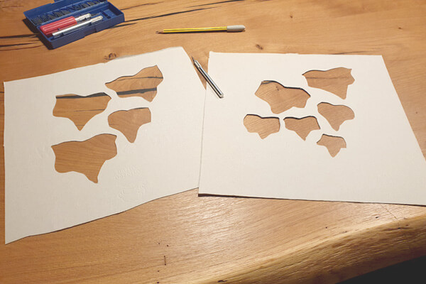
2) Lay out ivy leaves loosely on the cardboard in a natural-looking layer and trace with a pencil. Leave at least 5-8 cm distance to the edges of the cardboard. Alternatively, you can of course trace from a photo template.
Make sure to draw different leaf shapes and sizes so that you can spray as many variations as possible later.

3) Cut out the pre-drawn sheets from the cardboard using a box cutter.
Be sure to use a suitable support: cutting board or thick gray cardboard (e.g. from the back of a drawing pad).
Create 2 to 4 different arrangements to be prepared for every situation. In addition, you can then switch more often between the stencils and the paint on them has a little more time to dry.
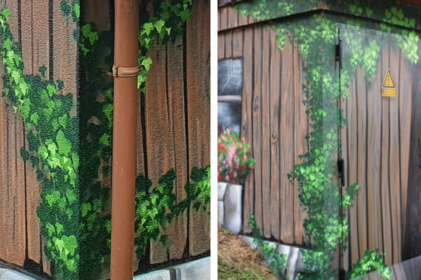
4) Start spraying on the wall: Start with the darkest color (6090 Deep Forest). Hold the stencil(s) against the wall again and again at different angles – even overlapped.
Pay attention to dynamic arrangement, be sure to use reference material e.g. your own photos or images from the Internet as a template.
To fill the intermediate areas a little more you can also simply mist some paint between the leaves without a stencil.

5) The next lighter color (6070 Smaragd Green) is mainly used to create some subtle depth. Proceed exactly as you did with the previous color, but use this layer primarily to make the leaf layers even denser.

6) The light green (6050 Greenery) now creates the first real depth effect. Unlike the two previous colors, you should never apply this color over a wide area. Think carefully about which areas should be more in the light and which should remain further back in the thicket. The best effect is achieved by irregular clusters.
If too large dark areas remain, you can break them up by fogging over the stencil with the light green to varying degrees, so that for some leaves only a light veil of light green arrives on the wall (see next image, top right).

7) Finally, selectively apply the lightest shade (6020 Green Apple) to the light green areas for the final highlights.

Summary